Portfolio
Labfolder
Redesigning an ELN for scientists around the world
Labfolder is an Electronic Laboratory Notebook (ELN), the paperless solution for scientists to their findings and scale their department's research. In technical terms, it's a web-based application to help scientists keep their data centralized while making it collaborative.
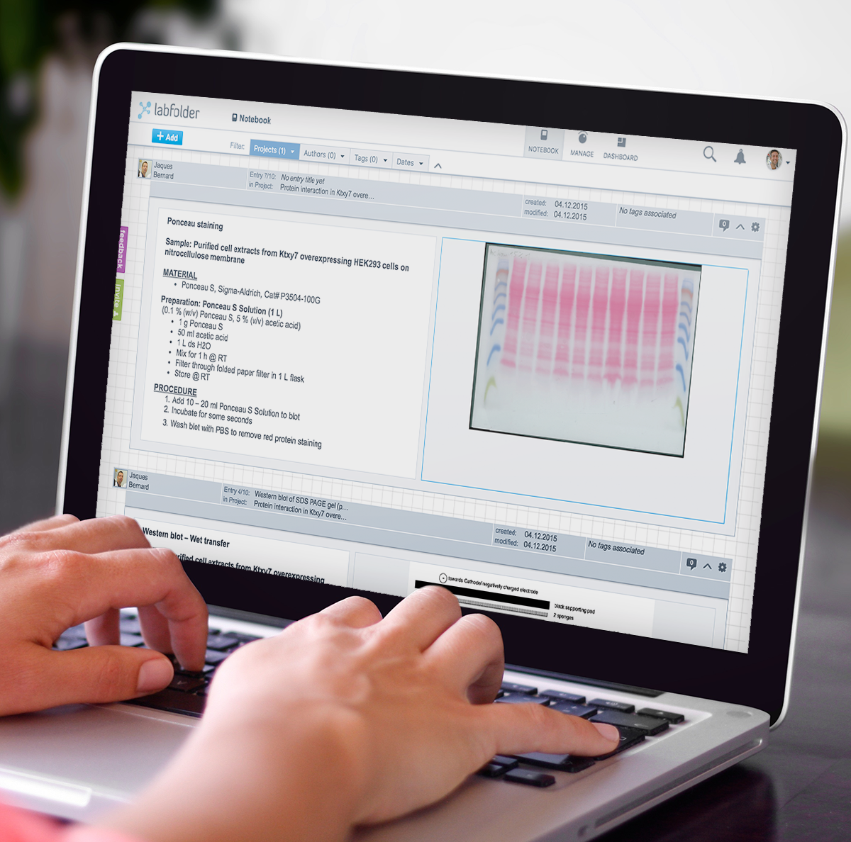
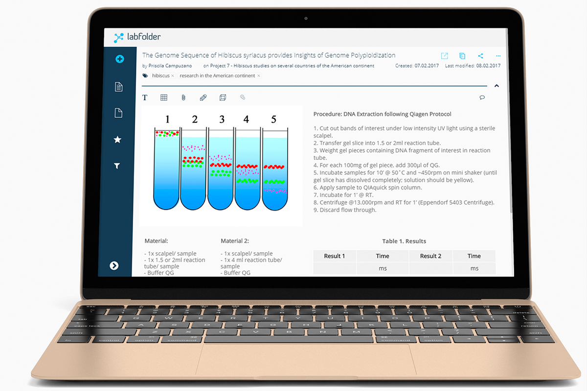
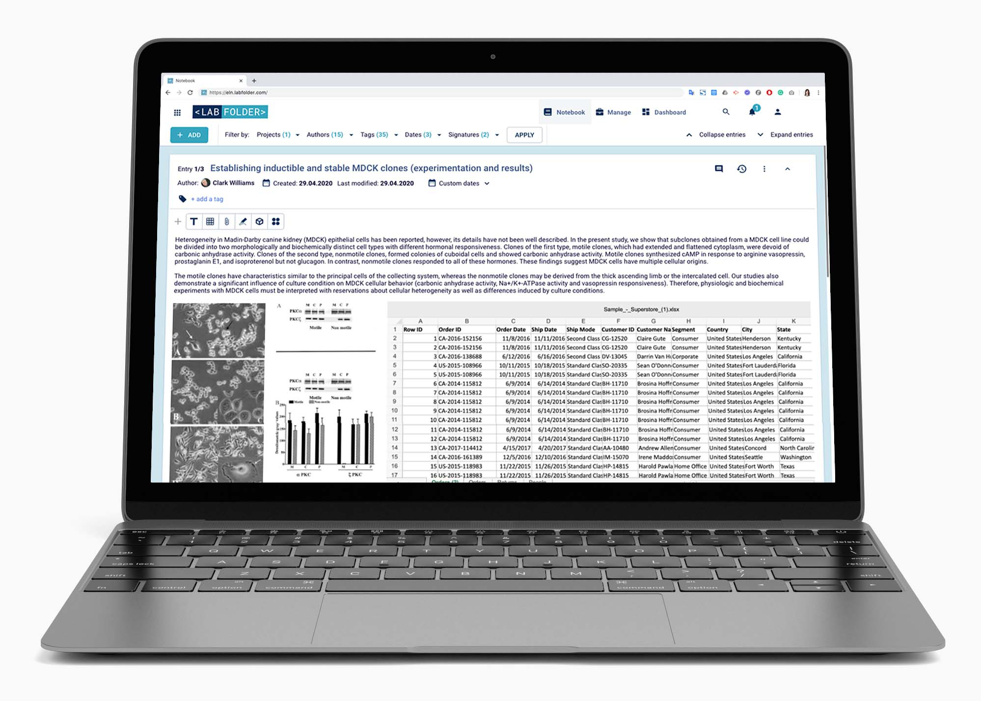
The specialized format of the ELN allows the scientists to upload and visualize any type of format required in the lab, making it a powerful tool not to miss any detail in research.
Among the functionalities developed, the scope includes a self-built WYSIWYG text editor with Latex support, an integration to a table editor with complex formula support, an integrated chemical formula drawer for chemistry purposes, a self-built file upload and visualization mechanism, as well as a self-built microwell plate editor for biology purposes to integrate with lab devices to read well plates.
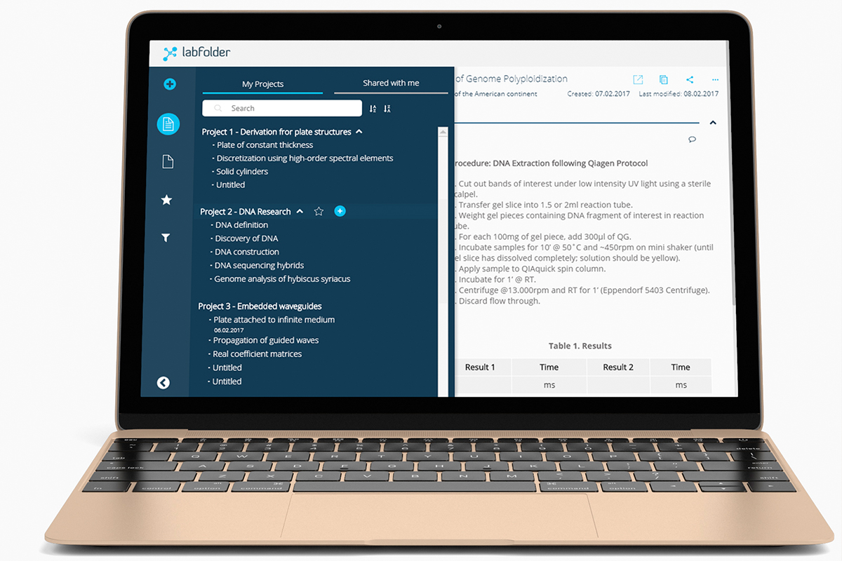
Other areas included in the collaborative aspect are the group management, project management, template management, and exports management, all ruled by permission definitions to ensure the right users had the right access to information within the organization.
| Company | Labforward GmbH |
|---|---|
| Roles | Product Designer, Product Owner |
| Scope | UX, UI, design system, information architecture |
| Tools | UXPin, Photoshop, Jira |
| Years | 2020-2022 |
| Brief | Redesign the ELN and other areas of the application having in mind system administrators, as peak users, who have access to everything in a research group (access to 100k+ entries). |
Originally designed by scientists and software engineers in 2013, the Labfolder ELN had an old-fashioned look-and-feel that resembled an analog square-paged notebook. Its primary intended user experience was a feed-based on filters and infinite scrolling, which eventually led to performance problems and leaving the scientists a bit confused, as the analogous experience to a scientific notebook had been completely lost (structured by projects and within those, experiments). There was no real way to find a visual clue of how to navigate the entries in a project. A general perception of "unordered" reigned when opening the application.
This is how it looked like in 2015, when I joined the company.
Due to budget limitation in the first years I worked with the team, I had a hybrid role between being a Product Designer and a Product Manager.
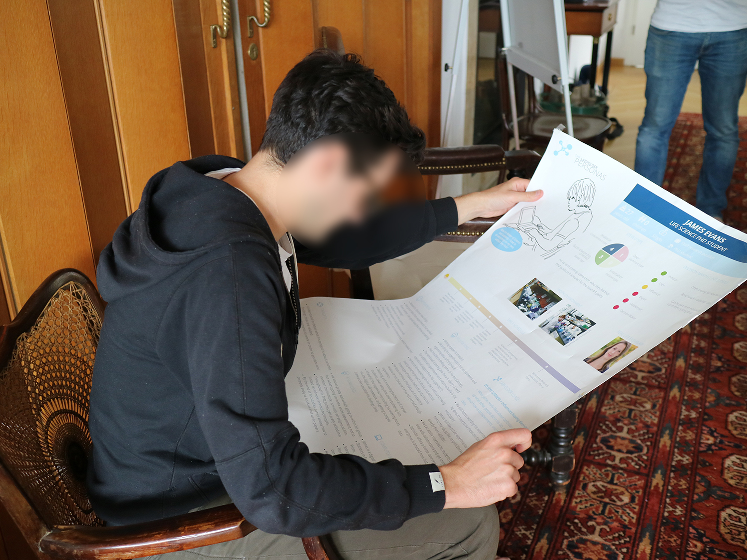
In my Design role, which I had from 2015 to 2020, I was directly conducting user interviews at the Charité - BIH laboratories, and through video calls during the pandemic times with LMU (Ludwigs-Maximilian-Universität München), MPG (Max Planck Gesellschaft) users, as well as with Tecan stakeholders. The interviews included UI AB testing, as well as interaction testing with functional prototypes (made with UXPin)
In my Product role, I collaborated directly with the CEO and the Marketing Team to bring features to the table that were needed before focusing on the big picture. I managed the backlog, ran sprint plannings, backlog refinements, retrospectives from 2015 to 2020.
The hot pain point that triggered the redesign, as mentioned before, was the way the navigation was designed and the obvious lack of findability of structure in the data generated by the users, along with the performance problems that heavy files brought along. The redesign wasn't really a design task, but a whole front-end and back-end task as well. By using User Story Mapping technique, the product and engineering teams were aligned on the business priorities and the team-oriented priorities, as well as on visualizing blockers and dependencies.
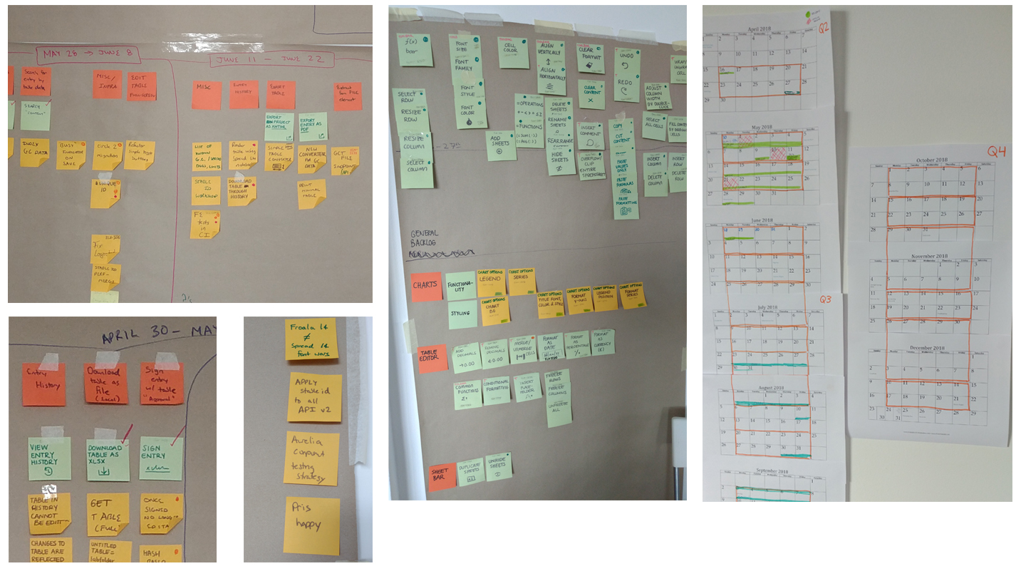
Design Sprints were introduced to start generating ideas in paper after going through hundreds of direct feedback reports sent to the support platform and after having videocalls with users to ask directly about their perception and expectations of the product.
Ideation workshops were organised with different stakeholders to see how similar the opinion was of the ELN. The previously generated personas were shared during these workshops to be validated and changed if applicable. New personas were also created during the workshops to cover new functionalities that were going to be developed.
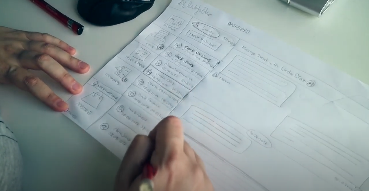
I started prototyping the most important features for the users, which were the filters, the navigation design, and the entries' design. The prototypes were functional to demonstrate what interactions would exactly be included, plus demo scenarios to let them understand what they could do.
By using a voting platform, I could determine the impact of each future to give a priority and draw trends.
For these first prototypes, a UI library based on the brand identity of that year (2016) was created, in order to start the front-end clean up and of course, the standardization of the UI.
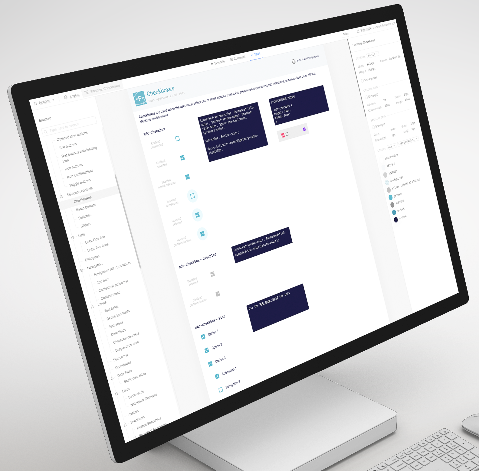
Because the company merged with another, new brand guidelines were created to fit the new identity. I started then to create the final Design System using the new color palette, as well as the font library, the resposive breakpoints we wanted to support and the microinteractions, while following best practices from Google's Material Design and meeting WCAG standards, to then restart the Notebook UI and its prioritized features following those.
Since agile implies trade-offs, the first approach taken from the product perspective was to reskin the existing user interface before proceeding to reimplement everything, to give users something new. For this, a 6-week sprint of paired design-development with three front-end engineers was performed, achieving the reskin of the entire ELN. The architecture of the filters and the navigation were left the same, but the notebook experience was polished and was portrayed as a white-paper notebook where blocks were not visible anymore, easing the visual load of each entry and its elements.
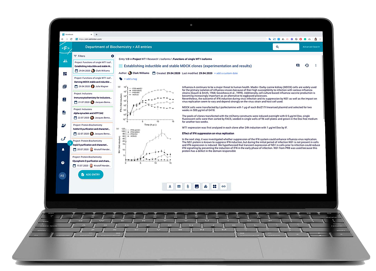
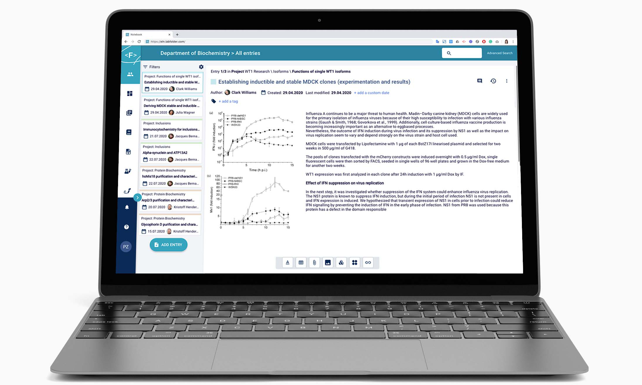
With more time in our hands, the moment to start the final UI redesign finally came. The end goal of the redesign consisted improving the navigation experiece by placing it to the side, and by having an obvious way to navigate the entries of a project by displaying them as cards to enable a notebook page-like navigation. This approach also aided the page load, which could get overloaded quickly with the amount of data and images displayed.
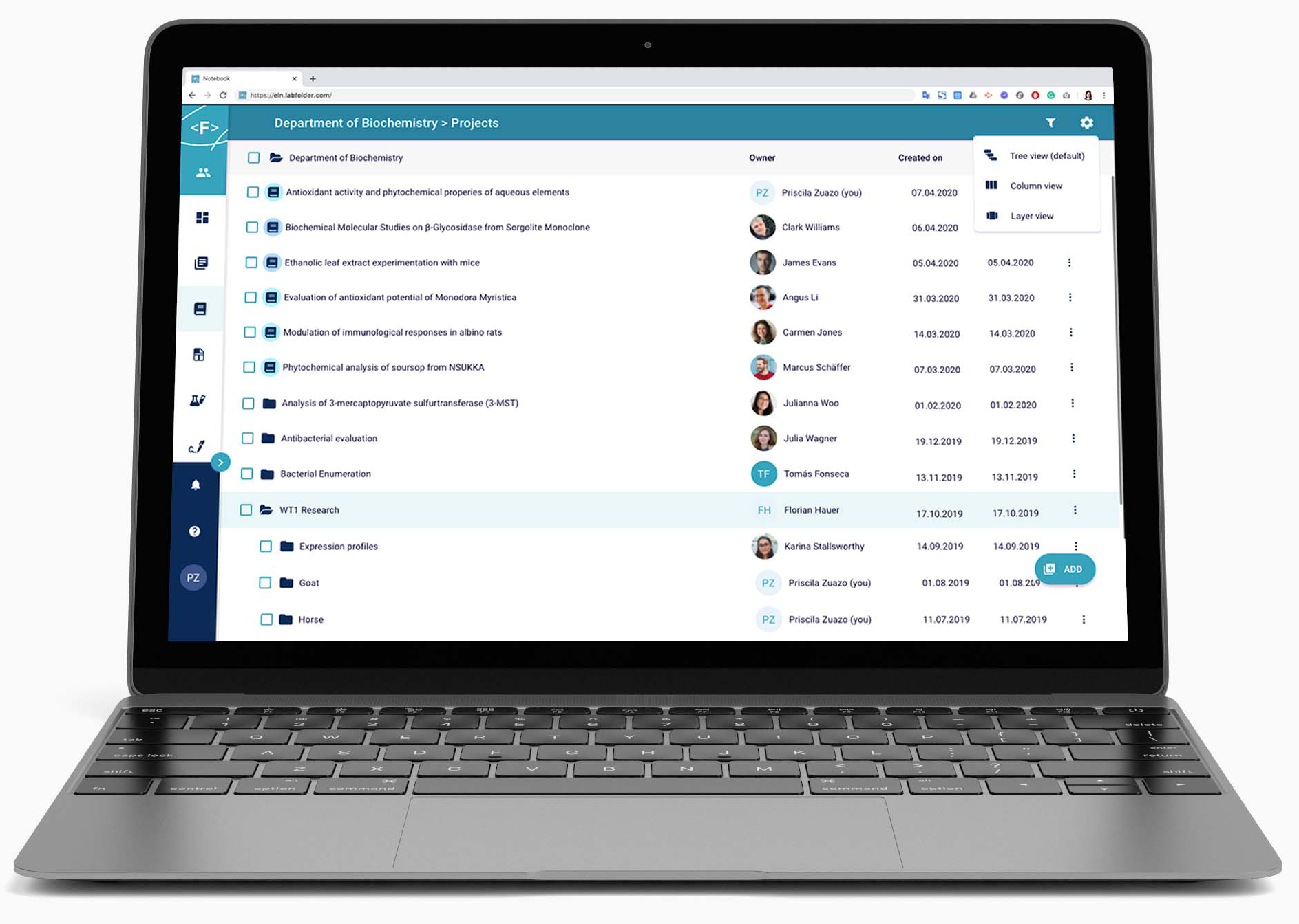
The project management area of the application was also revamped. Possibilities to browse projects by tree, column, or layer view were included. The challenge here was to be able to display 10 thousand projects in the worst case scenario (the most projects an organization ever reported that were visible to group administrator!). A functionality was implemented to choose the projects that were relevant to these users to ensure nothing was missed while not sacrificing performance.
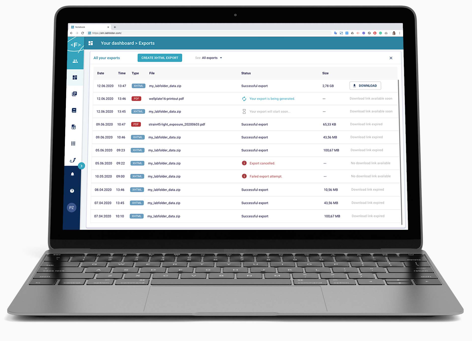
The export management area of the application had importance because users would tend to export their data for publication in scientific journal purposes. As the exports were asynchronous, an "export center" was built were all these exports could be found, as well as success, failure, and progress statuses.
| Registered users | 50,919 as of Q3 2022 |
|---|---|
| Active users | 48,233 (94.72%) as of Q3 2022 |
| User base | Scientists and researchers in these institutions: • Anchor Diagnostics GmbH • BIH - Berlin Institute of Health • Ceva Animal Health • Charité - Universitätsmedizin Berlin • Daichi Sankyo • Ichor Life Sciences, Inc. • ISTA - Institute of Science and Technology Austria • Johns Hopkins University • Gestlich Pharma AG • LMU - Ludwigs-Maximilian-Universität München • MPG - Max Planck Gesellschaft • Novalix • Olix Pharmaceutics • Technische Universität Cheminitz • UKE - Universitätsklinikum Hamburg-Eppendorf |